If you have subscribed to this blog then you know that it's been a really long time since I posted here. School and then new gallery committments and other personal matters have kept me away from teaching on line. But I'm slowly getting back into it. I may or may not choose to continue this blog but if I don't it will only be because I've moved it to another location in which case I'll notify you.
I uploaded my very first teaching video today to You Tube! I'm pretty new to this although I've had the camera for a couple of years, I just haven't gotten around to using it. So I traded lessons for help from one of my students who has been acting as a studio assistant. Anna is a young lady who has taken a class on vidography, (hmm - is that a word?) and so she was willing to jump right in and help out. We're a little rough around the edges yet, but I thingk we're improving and will get better over time.
I made this video for a student who lives in India and who takes lessons via Skype from me every week. I've been promising to do a demonstration for her for awhile now so we have her to thank for pushing me out of my rut and getting me started. Thank you Mamta! I hope this works for you.
Although I've evolved into a indirect painter over the years since my alla prima days of being a daily painter, Mamta is interested in learning alla prima techniques so I gathered together a couple of apples and put together this exercise. I enjoyed the process so much, I think we'll be doing a bunch more over the coming year. More alla prima because the practice is good for me - and a variety of other subjects as well. Here it is. Hope you enjoy it. I would appreciate any feedback you may have. Say it nicely please. :-)
Monday, September 5, 2016


Thursday, July 14, 2016
Studio Tour
Studio Tour
I have recently started teaching through Skype. Of course Skype is a great tool but it makes it difficult for my students to see what I'm doing when I paint because I can't direct the camera on my computer. Sooooo...the obvious answer is video! Now I'm no veteran video artist so this requires a learning curve. I pulled out my video camera - which was brand new about three years ago and which I only used once. I know. Bad, right? But better late than never. So as a practice exercise, I decided to do a tour of my studio which one of my Skype students thought would be nice to see. I must warn you, however, that I failed to do any house cleaning when I shot this and it's pretty raw. But it will give you a very good idea of the space I work and create in. So, welcome to my studio. Hope you enjoy the stay. I wanted to offer wine, however, there just wasn't an option for that on YouTube.
Saturday, December 5, 2009
How to paint Orchids and Tapestry

Ok, Ok, I know it's been a long time since I published. But, hey, I've been studying at an atelier in Seattle twice a week and teaching all day on Wednesdays. That leaves me four days in order to be a wife, clean my house, paint two days and do homework on the fourth. I'm out of breath just thinking about it. But I'm making up for it - I've got a nice long lesson for you.
In fact, it's so long, I've opted to put it on my website so that I could organize it better for you and make it go faster for myself. It still took me three hours to put it all together, so cut me some slack. The painting took about four weeks. Here's the finished piece, now just click here for the lesson. If for any reason the link doesn't work, go to www.susanspar.com, click on the link for "Student's Atelier" and then on the link for "Oil Painting Lessons and Still Life" and then on the link for "Lesson IV: Balance. Orchids and Tapestry". See you at the web page!
Wednesday, July 29, 2009
How to Paint a Magnolia Spray
Summers are always a very busy time for artists. It's when things really come alive in the art community. Art fairs start happening, galleries are all a buzz, art walks get under way and studios open their doors for tours. And that's exactly what I've been up to. Since I started attending atelier with Tenaya Sims six months ago, I've barely had time to paint let alone put together a lesson. And then when summer came along, well, the first paragraph says it all.


Thanks to Facebook, I've recently been connecting with old friends and one of my teenage buddies just commissioned a small painting from me. So I thought that I might as well kick off a lesson while I painted. This time I remembered to set my timer so I could take photos at regular intervals.
OK - here's the set up. My friend just wanted a spray of Magnolias without the attendant vase. Schucks! I really love painting vases, but alas, it was not to be. So the vase in the lower left hand corner will not be included in the painting. For the sake of expediency, I'll not be capitalizing the names of the paints. Now remember, the photo is for the sake of this blog. I NEVER PAINT FROM PHOTOS FOR FLOWERS! I emphasize this because it's something I'm adamant about. In fact, I almost never use photos except for the occasional landscape and then only because my bad and aching back doesn't allow for a lot of plein air junkets anymore.

I started with a sketch of the spray on a gessoed panel and then fixed it with spray fixative. Krylon spray will do for this. I followed up with a tone of raw umber - my preferred tone for floral underpaintings. Then I lifted out the lights trying to pay attention to where the shadows fell. I didn't worry too much about the stems as I paint them in last and can find them by just looking at the setup.Next I laid in a background of raw umber mixed with some cadmium yellow light, naples yellow and a tad of titanium white.
As always, I started laying in the shadow shapes keeping everything soft and not too sharp. The shadows were at this point a simple mix of ivory black, cadmium yellow and white - maybe a touch of ultramarine blue. The blue is sometimes a nice touch but not always necessary as ivory black is actually quite blue in tone. As a matter of fact, many of the masters used it before lapis blue became widely available. It's a credit to them that they managed, through a solid understanding of color theory, to make it look so blue.
The reddish tones were added by the judicious use of a little Pouzzouli Red (more about this color later). The yellow tones by the addition of a mixture of yellow ochre and white.
Of course the lights came next. Cool offsets warm and vice versa. I also used some of the background color to tie in the flowers with their background so they looked airy and not pasted on. Relative to the lights, the shadows are slightly cool. Thus the use of naples yellow and titanium white to make a warm white mixture is the trick here in making the lights pop. But here's another interesting and conflicting point - just to confuse you. Had I mixed a very small amount of ultramarine blue in with the white instead, it would have worked well also. That's because the cadmium in the shadows would have played off against the cool blue. Still, I like the way naples yellow brightens whites and I save a cool white for when I really want to throw a zinger in.
At this point I wasn't laying the paint on too thick. I wanted to keep my edges soft and add the globs of paint that would give sharper edges to the blooms after I decided where they were necessary. Things look relatively flat at this point, but hold on to your paint brushes. Things will start to improve shortly.
Here I've started to paint in the smaller flowers and buds. You can see that I've also started to add some thicker paint. Notice that I do this on the petals that are coming forward in the flowers. In order to push the ones in the back ground back, you paint those petals flatter and thinner. Thick accents thin just as warm accents cool.
Here's a closeup of the flowers.

Now on to the leaves. I generally don't carry a green on my palette but for for magnolias it's helpful to use a little thalo green. Now this is a very cool green because of a blue tint. Thalo is also a chemical color - not a natural pigment color. As a result, it has a very strong tinting strength and should never be used straight from the tube or in large amounts. I toned the thalo green with alizarin crimson which darkened it without warming it too much. Alazarin has blue in it and is a cool red. The use of cadmium red would have made the mixture too brownish (green/blue and red/orange cancel each other out). This cool mixture helped immensely when I got to the back side of some of the leaves which were a warm orangey color. Again, the play of cool against warm makes these leaves stand out.
The highlights or lighter passages on the blue/green leaves were done with a lightened background mixture.
For the orangey/brownish or golden leaves, I used a mixture of yellow ochre and touches of either naples hellow for the lighter parts or burnt umber for the darker shadows. As always, I laid in the shadows first!

Here's a closeup of the leaves.

Lastly, before I put in the stems, I punched things up a bit. The central flower was lacking color, so I warmed up the blossom by laying in touches of warm reddish tones. The color I uses is Pozzuoli Red from Rublev. It's a natural pigment but very close to burnt sienna, except it's opaque rather than transparent as is burnt sienna. However, burnt sienna should work equally as well. A bit more yellow ochre in a few places and some pinkish tones from a mixture of cadmium red light and white, and the color was right.
But I still wasn't finished. At this point, I sharpened some of the edges, deepened some of the shadows and thickened some of the lights. Then I added the center of the bloom with stamen.
The finishing touches came with the stems. These were executed with mixtures of alizarin crimson and Pouzzouli Red for the darks and touches of the leaf mixtures for highlights and some additional darks.
Here's the final piece. Hope you like it....hope my friend likes it.
"Magnolia Spray", 11" x 14", Oil on Panel
Friday, April 17, 2009
FLORAL PAINTING WORKSHOP
I'm done! My new studio is finished and ready for visitors. I'll be hosting my first workshop in the new studio and you're invited!
OIL PAINTING FLORALS WITH ATMOSPHERE AND LIGHT
Ala Prima with Susan Martin Spar
Tired of struggling to make a rose look like a rose or make a sunflower shine? Do your flowers look stiff or pasted on to the background? Having trouble choosing a background color?
This workshop is designed to help you
paint soft, lilting and believable flowers
that breathe.
Learn to paint the “air”
around your florals and give them a
feeling of atmosphere and light.
You will learn to:
Design a composition that works to bring the
viewer’s eye to your focal point.
Paint a flower convincingly in just a few brush strokes.Tie your painting together with color harmonyPaint your flowers in reflective and transparent receptacles.
TO FIND OUT MORE, CLICK HERE!
OIL PAINTING FLORALS WITH ATMOSPHERE AND LIGHT
Ala Prima with Susan Martin Spar
Tired of struggling to make a rose look like a rose or make a sunflower shine? Do your flowers look stiff or pasted on to the background? Having trouble choosing a background color?
This workshop is designed to help you
paint soft, lilting and believable flowers
that breathe.
Learn to paint the “air”
around your florals and give them a
feeling of atmosphere and light.
You will learn to:
Design a composition that works to bring the
viewer’s eye to your focal point.
Paint a flower convincingly in just a few brush strokes.Tie your painting together with color harmonyPaint your flowers in reflective and transparent receptacles.
TO FIND OUT MORE, CLICK HERE!
Thursday, January 15, 2009
Oil Painting Lesson for Peonies and Asian Vase

Here's a close up of the leaves and table flowers. It's not that noticeable in the photo but I've been enhancing some of the blooms by deepening color and scumbling lites in a a few places. Tips of the petals have more color in them and I've added this in a few places. Often things that are not at first noticeable to you, become more so as time goes by. These less obvious statements can be brought out in later passes.
There's a bit of reflected pink on the side of the vase where the flowers rest against it. I've added that as well. Notice there are no shadows yet on the table top. Generally these are added even before I start a painting, but I opted to use a glazing method to put them in afterwards. I wanted to develop the leaves a bit more before I do that.

So here I've started to add some of the stems and more leaves. In order to differentiate the ones in front from the leaves in back, I've lighted some of the edges on the leaves. I'll refine these even further in the last session.
Notice the cast shadows from the leaves on the table cloth.

I felt that the peony on the left side was a bit too lit up and it was stealing the show from the larger one which is the main focal point of the painting. Even though I loved the way that other peony looked, it's never a good idea to sacrifice an entire painting for the purpose of preserving a single passage. So I mixed a glaze of the Quinacridone Pink with some green and started to knock it down a bit.
Now that the pant is dry on the other flowers, I'm free to add some modeling to some of the petals by adding more lights and darks. The lights are added with mixtures of titanium white which has high tinting strength and small amounts of Naples Yellow or the Quinacridone Pink - depending on what I'm after. If I add a white/yellow mixture, the petal will round outward. If I add a the pink, it will tend to retreat a bit. Not as much as if I cooled the mixture with green, but just enough to turn the petal away from me.
I've also done some more darkening on the apple on the left. The stems and leaves are easier to view here.
Oops. Camera is a bit tilted here. But I think you can get an idea. I've mixed some Ultramarine Blue with some umber to tone it down. A glaze mixture with the use of Maroger Medium was combined and then using a soft sable, I started to lay in the lines for the blue design on the vase. I'm careful here to maintain the structure of the vase which is not quite round, but slightly squared off. The design helps to describe the form.
The paint under the glaze is completely dry so that it's safe to put the glaze on, and if I make a mistake, wipe it out with a brush that has been wet with thinner.
I took the time here to work some more on the petals of the flower resting on the table. I've darkened some of the leaves and created stronger cast shadows from them on the table cloth.
 Here I've added more details. The design the top of the vase is done by making a mixture of shadow white with a touch of ultramarine blue. Remember this part of the design is in the shadow.
I've also refined the shape and thickness of the blue lines and darkened the shadow under the vase and some of the other objects on the table.
Viola! Finito la comedia. Or, in other words, done! Much nicer when you get to view the whole piece in one shot.
The final design is in. I've heightened the lights on the vase in a couple of places by scumbling in some lighter mixture here and there. The table top is a bit more lit up where the apples are. I'm also finally happy with the peony that is drooping off to the left. It no longer steals the show and tucks back nicely with some atmosphere around it. I've darkened the table cloth toward the bottom of the picture as well.
Well, the painting is done, signed and for the most part, both the client and myself are happy with it. Hope you like it too. Thanks for stopping by. Remember, in order to see the whole lesson in one easy read, check out the lesson on my website by clicking here.
"Full Bloom"
18" x 24", Oil on Canvas
How to Paint Peonies, A Commission, Final Session

It's been a few busy days. My studio is much further along than the last time we spoke. :-) and I've attended my first atelier class with Tenaya Sims. A terrific day! But I'll save that for another time. Let's get started.
In the last session I stated that I wanted to revisit the background. I felt it was too busy and so the first thing I did upon opening this session was to oil out with Maroger and then repaint the background. I mixed a new mixture with Raw Umber, Cad Yellow and a touch of Cobalt Blue to cool the mixture. It looks a bit warm here but that's the light. As my windows are now completely blocked off with plywood (they took them out to put them in the new construction), I didn't have any cool natural light to balance the overheads. I think in later photos, it's true tone will become evident. Anyway, it looks better. Don't you think? All those swirls in the background were just too distracting. This is just the right amount of atmosphere and light.
I've added some twigs here for interest. Remember that straight lines are much more attractive than lines that are curvy. In this case, the straight lines form a nice contrast to the curves of the petals and help to create directional lines for the composition. These were done with a palette knife. A little trick I learned at the David Leffel workshop. Slide the edge of your palette knife through the pant and then carefully set the edge against the canvas and pull the knife outward in the desired direction. It does take a bit of practice, but it's well worth the time investment.
Friday, January 9, 2009
Just a note to let you all know that I'll be holding off on publishing the last couple of lessons on this commission piece until after it's finished. I feel it's only fair that the customer be the first to see the finished piece. There have been lots of changes since this morning and I'm quite happy with the way things are turning out. Stay tuned. I'll publish again in a few day or quite possibly by Sunday evening.
How to Paint Peonies, Day Four

Today proved to be a trying one. I had contractors, engineers and inspectors banging all over the house and the constant interruptions had me banging my head against the wall and sniffing paint fumes in a vain attempt to escape it all.
But in spite of all the craziness, I did manage to get a few things accomplished. I had the curtain on the French door behind me open and so had a bit of cool light to paint by. Hence the bluish tint on the left side o the canvas. That shouldn't prove to be too much of a difficulty here as I'm illustrating the last of the flowers in this picture.
I re-entered the painting by first giving a slight blue glaze to the background to cool down some of the yellow tint in the umber background. I'm still not sure of the tapestry look and may decide before painting in the leaves to just make the background solid. It feels a bit distracting to me.
After glazing the background, I finished off the last three flowers. These are still not quite done at this point and I'll get back to them before the close of the session. It's difficult to work out all the values on the flowers until their surroundings are painted in.
 Time for the apples. I started with their shadows by mixing in a bit of burnt umber and a touch of yellow ochre for reflected light. Then I was on to the shadows of the apples. I started with raw umber and some Cadmium Yellow Light mixed in. This was further toned with a little Cad Red Light. I mixed this lightly with some toned down Thalo Green for the more colorful spots on the apples. A touch of Yellow Ochre and white for the reflected light becomes evident in the next photo.
Note that an object's truest color will be on the turning edge just as the light on the object turns to shadow. The core shadow follows this. It's easiest to remember this by just noting that light washes out color and shadow obscures it.
 The lights are added in here with some Cad Yellow Light, white and a touch of umber to tone the brightness (although that's hard to tell from my camera). The reflected lights are more evident here.
I've also painted in the table top, although this too will be brightened eventually. A bit of Yellow Ochre and Burnt Umber with some Naples Yellow lights up the table.
 The top right hand corner of the background looks a bit warm here. Some of that may be due to the fact that the cool light from the door behind me is not falling on that portion of the canvas.
In either case, I'll need to reassess in the morning with natural light coming in evenly. I have a skylight just outside the old studio that can be used for this purpose. I use two color corrected Ott Lights additionally, but find that the skylight is best for this. I will be such a boon when the new studio is finished. I have a seven by five foot arched north light window in it. Perfect for this sort of thing.
I've started to put in the shadows for the table cloth. Notice that I've painted out the leaves here. I know where they're going and have decided that it would be best to paint them in over the table cloth. This is always a last minute judgment call for me as I often paint them together with the cloth and background. I've been taking my time here so things are developing a bit differently. Shadow color is a bit of black, Cad Yellow Light and white. I've warmed it a bit with Burnt Umber.

I simplified the table cloth and reworked it several times before I felt I could leave it for a bit and move on to the cut apples. Like everything else, I'll revisit it several times during the next painting session. The cut apples were done much the same as the larger ones. Note that I've gone back and darkened the interior of the other apples.
The lighted table cloth is done with Naples Yellow and White. This is just a slightly warmed mixture of white, not a cooled mixture of yellow. But the temperature difference is enough to make the table top pop. Additionally, I took small amounts and used it on the flowers in a few places where I wanted the light to sparkle on the flowers. That warm light really works against the cooler pink . I know it sounds strange - but remember temperature is relative. My pinks are cool pinks and the white is a warm white.
 This is perhaps the best representation of what is happening in the painting thus far. The color is a bit softer in this photo and the contrast not as sharp as in the others.
 I deepened the shadows around the flower at the bottom that is drooping off the table edge and heightened the edges so that it stands away from the table cloth. The table cloth and the back of the table itself are softly inferred in the background. A little light peeks in behind the cut apples. I've also taken some Quinacridone Pink glaze and brushing it into the tips of the petals.
There's much I need to do here and I have only three days before they tear into my studio rendering it unusable for a few days. So tomorrow is another day. It's midnight and I've posted this first to my website so I'll copy it over to the blog in the morning. Nighty night.
Wednesday, January 7, 2009
How to Paint Peonies, Day Two

Well thanks for checking back in today. I actually painted this lesson over two days starting with the background yesterday and continuing with the flowers today. Here we go. If you'd like to read this lesson in a more consistent manner that flows from top to bottom without having to skip around blog style, click here.
The background was the first thing I started on with color. I generally choose an umber background for pink because the slight green tint sets off the pinks in the blossoms nicely. This mix was done with a combination of Burnt Umber and Raw Umber plus a bit of Cad Yellow Light and Naples Yellow. The lighter tones were done with a bit more Naples yellow. I was looking for a light feeling of tapestry here. As the painting develops I continue to work the background. I like to have it slightly wet as I work because that allows me to fade flowers into the background. Again - I apologize for the glare. Not much I can do about it under the circumstances. Each time I pause to take a picture, I have to turn lights on and turn others off. It's a bit tricky and breaks my concentration so I try not to have to do too much in that arena. Also, what looks fine in the camera, often looks quite different once I download the picture.
I worked some darker umber and Ultramarine Blue into the background on the lower left hand side and into the shadows on the tapestry.
For the vase, I used my usual mix of black, Cadmium Yellow Light and white along with a touch of the background color. For the light struck area, I used Cremintz White with a touch of Ultramarine Blue. Some of the shadow color was added as well. This is only a preliminary under painting for the vase.

I vowed this time around that I would try to give more step-by-step on the flowers - so here goes. I used a shadow color which was mixed by combining Quinacridone Red and Cadmium Red Light plus a bit of Cremintz White. The Cremintz White is a very thick impasto white with low tinting strength. Good for low tints and where you don't want to wash out the color. It's also lovely for building impastos.
I brushed this color combo into the areas where the darker richer interiors of the Peony face away from the light. I used a bit of Cadmium Orange to place warmth into those shadows.
When I mix these colors, I try not to over mix them with a palette knife, but instead use my brush and whip them up a bit to where they are delicately blended - like making muffin batter. Too much mixing and the muffins go flat.
For the reflected lights - always a tough call - I used a bit of Quinacridone Pink which has more blue in it. This was mixed with a bit of background color that had been lightened with touches of white to gray it a bit. Shadows are always deeper near to the object which casts them. So I brushed a bit of Raw Umber mixed with Ultramarine Blue into the shadows closest to the Peonies. The vase is still very simple at this point. I'm only suggesting the shape at the bottom where the shadow curves a bit. Later, I'll place some background color to deepen shadows and bring atmosphere forward into the painting. I've also deepened the shadows on the tapestry in the background.
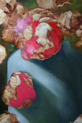 Here's the close up. You can see the brush work is kept light. When painting the inside of a flower, you have to figure that that part of the bloom is receding from you and paint it thinly - just as you would shadows.
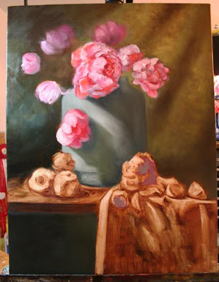 OK. I took another shot here to better evaluate the light. For this stage of the painting, I'm satisfied. I can see where I will want to darken some of the flowers on the left. This, however, is best left until they are dry and then I can just glaze into them. I rearranged the shapes of the larger flower and used the larger brush to do the petals. I have two more flowers to paint in the next session and then I want to re-evaluate the background and the overall shape of some of the blooms. Once I've tweaked those, I'll start into the objects on the table.
For the background, I'm considering a glaze with a very thin coat of blue to cool it a bit. I can better evaluate it in the light of day however, and I'll rethink it all in the morning. Good night and I'll continue with you tomorrow. Thanks for stopping by.
I brushed this color combo into the areas where the darker richer interiors of the Peony face away from the light. I used a bit of Cadmium Orange to place warmth into those shadows.
When I mix these colors, I try not to over mix them with a palette knife, but instead use my brush and whip them up a bit to where they are delicately blended - like making muffin batter. Too much mixing and the muffins go flat.
For the reflected lights - always a tough call - I used a bit of Quinacridone Pink which has more blue in it. This was mixed with a bit of background color that had been lightened with touches of white to gray it a bit. Shadows are always deeper near to the object which casts them. So I brushed a bit of Raw Umber mixed with Ultramarine Blue into the shadows closest to the Peonies. The vase is still very simple at this point. I'm only suggesting the shape at the bottom where the shadow curves a bit. Later, I'll place some background color to deepen shadows and bring atmosphere forward into the painting. I've also deepened the shadows on the tapestry in the background.
 Here's the close up. You can see the brush work is kept light. When painting the inside of a flower, you have to figure that that part of the bloom is receding from you and paint it thinly - just as you would shadows.
 Here I've started to put in the highlights on the lit side of the flower. The paint is quite thick. I'm using the same color that I used in the interior passages but lightened with Cremintz White. I'm using a 1/2" DaVinci Filbert Bristle brush. Bristles are best for impasto work because they are just stiff enough to hold the paint.
For the initial strokes I used a 1/4 inch brush but decided that it looked too picky so I changed to a larger one and went to a technique that I'm comfortable with.
I didn't have anyone to take a picture of me laying in the petals so I'll have to describe the technique. After I've loaded the brush, I lay the bristle's at a 30 degree angle to the canvas and starting at the center of the bloom I make the petal using one stroke by pulling the brush outward to circumference of the flower. I apply more pressure at the start of the stroke and lift off the brush at the back end of the stroke. This is a little tricky and takes some practice.
This stroke is more evident in the last two pictures.
Notice that the lights are bright, but there's not enough punch or contrast between them and the shadows. This is because Cremintz is a low tint white. I'll fix that in the end by using a bit of the same color mix but with Titanium White and some Maroger Medium.
I next moved on to the back ground flowers. These were mixed with a bit of Quinacridone Rose which has a bit of blue in it. You can see that color in the flowers facing away from you. Because they are in the background and less distinct, I softened the edges by brushing some of the background into them.
Notice the large bloom in the front and the smaller bloom just behind it. There's not a huge difference in value here so I used a bit of edge control to push the one on the right back by making the edge of the flower in front a bit crisper. I also used little or no detail in the inside of the flower on the right. Less detail, less reason to spend time looking at it. Control your viewer's eyes by the use of edges as well as values.
Notice that I've painted out the leaves. I decided I would rather design them as I go in the last sitting. Those are details that will be a bit demanding and may take more than one sitting to get right so I'd rather not have to paint background around them when I'm done. Instead I'll use some Maroger to oil out the canvas and paint into it with the leaf colors when I'm ready. The background is an easy mix and can also be added if needed at a later point without having matching problems.
 OK. I took another shot here to better evaluate the light. For this stage of the painting, I'm satisfied. I can see where I will want to darken some of the flowers on the left. This, however, is best left until they are dry and then I can just glaze into them. I rearranged the shapes of the larger flower and used the larger brush to do the petals. I have two more flowers to paint in the next session and then I want to re-evaluate the background and the overall shape of some of the blooms. Once I've tweaked those, I'll start into the objects on the table.
For the background, I'm considering a glaze with a very thin coat of blue to cool it a bit. I can better evaluate it in the light of day however, and I'll rethink it all in the morning. Good night and I'll continue with you tomorrow. Thanks for stopping by.
Monday, January 5, 2009
How to Paint Peonies
"The Peony Commission"
Working Title

Working Title

Peonies are such beautiful, lush flowers that it's no mystery that they are loved by nearly all flower aficionados. I received this commission a couple of days ago and thought it might be fun to share the painting process with you.
The size of the painting is 18" x 24" at the request of the client. I sent her three compositional images and she decided on this vertical format. I'm glad because I'm a bit partial to this composition. Mainly this is because I love drama. Even in something as quiet as a still life, there can be great drama.
Notice how the composition is at eye level. You can basically divide the canvas into three areas. Below the table, the top of the table to the Golden Mein (about one third of the way down from the top, and the top one third where most of the flowers reside.
I chose an "S" composition for this floral as I often do in vertical compositions. Notice how the flowers form a backwards question mark or take an actual "S" direction. I chose green apples to offset the prinks in the flowers. I actually added some cut apples to the right after this picture was taken. They become apparent in the painting.
I first prepared the canvas a couple of days in advance by coating it with a thin layer of under painting white mixed with Liquin to help it's drying time. I did this for two reasons: first, I prefer a smooth surface to one with texture and I like the way paint moves on a surface that has been primed with paint. The white under painting will cause the flowers to glow with an appearance of light emanating from within as the painting ages.
When the canvas was dry, I drew with charcoal the actual placement of the major elements and then sprayed the whole thing with a touch of hairspray. Nice to know that stuff is still useful for something.
Next I wiped on a thin layer of Burnt Umber mixed with Quinacridone Orange and then started to lift out the lights. I like this process of under painting because it allows me to make decisions as I go. If something doesn't look right where I've placed it, I can easily move it by painting back into the toned canvas and wiping out the lights elsewhere. But my drawing was good here and I was pretty happy with the way the flowers were placed. I had made some changes to the flowers you see in the photograph until I was happy. Often, I won't see things that need fixing until I start to get things on canvas. That's why I can't work from photos. Things looked flat in the photo I sent to the client but really started to fill out nicely when I started actually lifting out the lights on the canvas.
Here you can see the under painting developed further. I added a bloom or two to the left and filled out some other areas. I moved the flower on the table further to the right and the small one further to the left to bring out more of the "S" shape I was referring to. The large Peony in the top left of center is right about on the intersection of the Golden Mein, the sweet spot of the painting and where I want the viewer's eyes to go. While it takes precedence now, it will be a challenge to keep it's importance once color is added.
I pulled out lights where the light spills from the left across the vase. You might notice now that there is no design on the vase. That's the last thing that gets added to the painting.
I've filled in some leaves and you can see now also where the apples and cut apples fall. I've brushed in some shadows as well to unify the piece.
OK. I'm about done here. The cloth is not quite finished and I'm thinking I'll change quite a bit on there as the painting proceeds. I often move the light source to provide a few shadows and lit parts on the cloth in the front. I don't want to do that until the majority of the painting is done as once the light moves, it's difficult to get things back where they were. While a purist might say that the shadows will not be true to life, an "artist" knows that what works in a painting is not generally true to life in all cases.
I've lightened the background on the right. This will add more depth to the painting later. It won't be bright, per se, but will be a softly shadowed mid tone to allow the flowers to fade into it. The left side will be darker.
All this, mind you, is subject to change. But for the most part, I'm happy with this first stage. Check back tomorrow or the next day to see the next step. Thanks for tuning in.
If the lesson is difficult to follow on the blog, I suggest you click here to follow it on my website where the type flows smoother. Just click on "Peony Commission" when you get there.
Monday, December 29, 2008
How to Paint Orchids
"Arc of Orchids"
8" x 10" Oil on Panel


8" x 10" Oil on Panel


I've been wanting to do Orchids for some time and so I got busy early today and set these up in my shadow box. So here's the set-up.
I used to paint very hard edged reflections when I first started painting still life and have since gone to a softer more romantic look. We'll talk more about that as the lesson progresses.
I'm currently unable to paint by natural light due to the fact that my windows are no longer looking out on the world but on the inside of my new, presently unfinished studio. While there's a beautiful seven foot arched window that faces north in there, none of the light reaches my old studio. When they punch through to the old studio, that room will become my new office and I can set up my still life's under the beautiful soft north light that comes in from the arched window. In the meantime, I'm using a plant light that sort of replicates natural light, but still tends to the warm side. Hence, the rather gold looking tones in the silver bowl.
I started by laying in a basic sketch of the still life with some raw umber and mineral spirits. The yellow ochre background you see is the color of the gesso I used to tone the board. Daniel Smith makes it and I like it because it saves me the trouble of toning a board a few days before I start to work. I don't always know in advance what I'm going to want and also don't have enough spare boards on hand a lot of the time to create diversity.
Working on a toned surface is important because it allows you to better judge values (lights and darks). There I go again talking about values. But they're soooo important.
I did the background first and reserved the shapes of the flowers. Note that in ala prima painting, you try as much as possible to reserve the areas where you are going to place flowers because it's too easy to muddy the colors otherwise.
I used Viridian Green, Raw Umber, and touches of Ultramarine Blue in making the background. I chose the Viridian because it's bluish tint would set off the reds in the flowers without making them too vibrant. The lighter areas were lightened with a touch of Naples Yellow because it's less cool than white. I wanted it a bit lighter where the second bunch of blooms fall because that's where the lightest petals will be and I wanted to lighten the "air" around the flower.
The color of the flowers is mixed with Daniel Smith's Quinacridone Pink. His Quinacridone colors are very intense and don't lose their intensity when you mix them with white. I used a bit of Alazarin Crimson and Ultramarine Blue for the shadow parts and Cadmium Red Light for the center petals.
Note that I use the largest brush that can get the job done. I start with a single stroke - beginning and ending the stroke. I don't go back in and belabor it. That's not to say that I don't use smaller brushes for the detail and places where the petals have highlights on them, but I try to use a loaded brush and get the stroke right on the first try. I'm not always successful. But I'd rather wipe it off and try again, than have an overworked flower.
The pot here is started with Burnt Umber and also some of the background color mixed in. This is important to do in order to give the pot the appearance of being part of its environment. Air, so to speak.
Here I've started to put in some of the background flowers. I'm not working too hard to bring detail into these. You can't see detail from the distance I'm sitting at so why should the viewer have to see it. It's important to keep that in mind. I hear from my students a lot that they "can't see" well enough to get these vague areas. Precisely. That is the point. They are vague.
I'm using Naples Yellow on the pot to bring out the patina. I don't want a hard highlight even though that's what appears before me because of the artificial light. So I lay in the paint and then soften the edges moving out from the center with my brush. You can see a bit of Burnt Umber on the pot here where I've warmed it up to bring it forward in the bulge. I've started the reflection of the cloth, making sure to keep my edges very soft. Inside the pot there's some lovely reflections of the petals but they look a bit orangey to me, so I've tentatively started them that way. They'll likely change as the painting progresses because my eyes will adjust further and color relationships will become clearer to me.
Here the second flower is in and you can see how the bloom is a lot brighter. The picture is a bit on the light side here because I have an Ott Light above it. I've made better adjustments for this in the final picture.
I've put some color into the inside of the pot. A bit of Burnt Sienna and Naples Yellow with Burnt Umber for the darker areas. I've still reserved that orangey spot.
The last of the blooms are in here except for two. Nothing much has changed in the pot at this point except I've darkened a band around the rim.
Sorry for the glare here. It's very hard to see on the camera when I'm taking the shots. The light in the studio is so carefully set with overheads off and separate lights dimmed and directed away from the still life, that it's too dark to just snap a shot. I need to use a longer exposure that tends to pick up more light from other sources than I can see on the lCD display.
I've added the reflections from the blooms on the pot and also brightened the rim of the pot. Nothing much done on the inside yet.
My timer didn't go off so almost 20 minutes elapsed here. The last two flower have been added and I also put in the stems of the flowers. The stems are made up of some of the Viridian Green and a bit of Cadmium Yellow Light.
On the fruit, I started by laying in the core shadow shapes with a darker (OK, I know it doesn't look light) mixture of Viridian and Burnt Umber. You can see this on the apple to the left. The cast shadows were laid in with Burnt Umber on the table portion and a shadow mix of Ivory Black, Cad Yellow Light and White on the table cloth. I brushed in a bit of Yellow Ochre in both shadows to make them more transparent.
The apple color was basically Viridian, Cad Yellow Light with a bit of Cad Red Light to tone the hue. I used the darker mixture of Viridian and Burnt Umber for the turning edges and shadows on the apples slices.
Note the Yellow Ochre in the table cloth. Adding a bit of this or Cadmium Yellow Medium will make a white cloth glow when used sparingly in the shadows where you see light coming through the cloth.
The pot is looking up here. I've rounded the shape a bit and added a highlight to the rim of the pot. I'm starting to see more color in the interior but won't add it until later.
This is the finished painting but it took another hour or so to get here.
The lights on the apple are in. Simple combo of Viridian Green, Cad Yellow Light and some white on the highlight portion. The stem was just some dark Burn Umber.
I've added the reflections of the fruit to the pot and brushed some more color from the flower into the bulge of the pot in the front to bring it forward. Note that the reflections in the pot are vague. I didn't make them sharp edged because to do so in this type of painting only confuses the viewer.
The apple core color is Naples Yellow and a touch of Cadmium Yellow Medium. The pits are just a smidge of Burn Sienna.
For the table top, I used some Burn Sienna, Naples Yellow and touches of white to bring out the area where the light is hitting it. The front of the table is just a darker version of this color with smudges of Burn Umber and background color.
For the handles and foot of the pot, Just some small blobs of Naples Yellow and White mixture on a vaguely painted handle of Raw Umber. Note the shadow of the handle on the left side. This pops the handle and helps to give a dimension of reality. It's these little touches that make all the difference. Thanks for stopping by!
If you'd like to purchase this painting, visit my blog at www.susanmartinspar.blogspot.com and click on the "Buy Now" button. You don't need a PayPal account and can choose to use just your credit card. $99.00 USD plus $15.00 S/H.
Monday, November 17, 2008
How to Paint Pink Roses in Two Hours
My deepest apologies for having taken so long to post to this blog again. I've been touring the Mediterranean and before that summer had me in high gear for the festival season. But winter is here again - nearly, and so I'm back to my routine of publishing regularly.

I thought I'd start off with a small painting I did today for Daily Painters. I thought that after a month or so away, it would be really hard to get into the studio, but I found myself getting excited about squeezing out paint as I moved around getting a small set up ready. The construction guys are working on my new studio so it was comforting to push paint around while I listened to the steady drum of hammering on my new roof.
I know that I promised I'd talk about my workshop with David Leffel but I've decided that I'd talk about what I learned as I integrate it into lessons. That way it sticks for me and makes better sense for you. So, let's begin.
Here's the set up.

Sorry that this photo's a bit on the blurry side. Before I left on vacation, I put everything away in anticipation of the construction crew breaking through to the old studio. So much as for construction schedules. I had some trouble locating the tripod. Don't worry - it gets better. Just a reminder to new folks just tuning in for the first time. These shots of the set up are just for your information. I NEVER use photos to paint from in still life. Photos distort and generally mask color and light in disproportionate ways. Shadows are always too dark and lack color and the highlights are always washed out. Texture all but disappears. I always work from life when I can, and I encourage and teach all my students to do the same.
I kept the setup simple here because I needed to ease back into the painting process after a month away. In the next photo, you can see how I blocked in the basic shapes. I sort of drew the composition in with raw umber and then filled in the shadow areas with umber to get an idea of the composition and how I wanted to fill the space.
After I did this little sketch, I decided that the whole thing needed to be moved down a bit and when I started to fill in the background, I did so. I used a combination of Thalo Blue, Ivory Black and Raw Umber to work in the darker areas of the background. The same combo with more white and Naples Yellow was used for the lighter area.
You can see that I haven't yet moved things down here, but it becomes evident in the next photo.
David Leffel prefers filbert bristles and that's a big change for me. I have traditionally preferred to use sables and still do for the smoothing of a background. But here you can see that I am using a palette knife which is another of David's favorite tools. I am quite enjoying the mastering of this tool and find that it works very well for helping me to attain the texture I desire on my vases.
To turn the vase, I used more of the background color with a bit of Ultramarine Blue. I darkened it a bit more with Ivory Black and used it along the core shadow. This added some drama to an otherwise ho hum set up. For the vase itself, I used white, some of the Thalo Blue and a big of Naples yellow. I didn't mixed the color evenly but just jostled it a bit with my brush to give a more interesting mixture. Then after using a brush in a cross wise (across the form) motion, I then turned to the palette knife to bring in texture. Notice the reflected light on the shadow side. Just a slightly lighter mixture.
I find students get all tied up over what "color" to make the reflected light. I'm a bit like David here in that I use color on colorlessness as my MO. That means that I don't dither too much over the dead areas but keep them simple. You can choose to add some color in the reflected light areas but they should be kept generally cool in temperature. Shadows should be warm. I laughed at the workshop when I heard David say to a student, "cool light, warm shadows; warm light....uh...warm shadows." Shadows just look a lot better when they are warm. If you are using blue in your shadows, use a warm blue - one that has red in it to warm it. Here on the cloth, I used some of the background color neutralized with raw umber to warm it a bit. I felt OK using that blueish tone because there was so much of it in the background and vase already that it made sense to use it in the shadows.
For the cloth, I used a touch of the background color with Ivory Black, a tiny bit -TINY - of Cadmium Yellow and a touch of white for the shadows areas. Some warmth was added in areas with some Yellow Ochre ans white. The light areas of the cloth were done with white and Naples Yellow. I used a palette knife in places to build up the highlights.
For the table top I used a bit of Burnt Umber, white and Cadmium Yellow Light for the top and for the sides, just Burnt Umber. I kept the brush work loose and strove to keep it light. Next, on to the roses.
I like to use quinacradone colors for my pink or red flowers because the color is very intense and doesn't get washed out with white as do the Cadmium reds. I used Daniel Smith Quinacradone Pink for the base color of the roses and then I added mixture of Cadmium Orange and Cadmium Yellow Deep to it to bring out the coral color in the roses.
While it looks like there's a lot going on in these flowers, their construction was really quite simple. I used a medium size filbert and brushed in the center color. A couple of strokes was all it took to make the petals. Where I wanted a petal to turn or an edge to come forward, I piled on the paint, made the edge sharper and sculpted the paint. I use Maroger Medium for this as it allows me to retain brush strokes and build the paint up. I grayed out the pink with an addition of background color (it looks more blue here than green due to the thalo, but in reality it has more of a green cast which neutralizes the pink in the flowers and makes for a good shadow.
In the last photo and the finished painting below, you can see the leaves were worked in last. I used Thalo Blue and Cadmium Yellow Light with touches of Naples Yellow here and there. For the darkest parts of the leaves, I mixed the color with a touch of Ivory Black to strengthen the darks and shadows. Let me emphasize the fact that when I use Ivory Black, these are just little dabs of this neutral. Ivory Black has a lot of blue in it and can actually be used in some paintings as blue if properly painted alongside colors of more neutral or warm tint. Try making a lovely green by adding some Cadmium Yellow to Ivory Black. You couldn't do that if it didn't have blue in it. You just don't want to overdue the black or use it by itself for shadows. It would deaden the space. Shadows should have some color or light breathed into them. That's why I use Cadmium Yellow in my shadows. The last thing I did here was to add more Naples Yellow to the background to liven it up and some pure Quinacradone Pink and Alazarin Crimson in the center of the flowers. A quick little warm up to get back into the flow of paint. Any questions, just post them here and I'll answer them for you so everyone gets to see the answers. Thanks for tuning in!
Subscribe to:
Posts (Atom)


