Here's the set up. The light is cool north light from windows on the left. It looks pretty unimpressive here. But wait. That's the fun part.
I broke out the acrylic black and white and pulled started in.
As you can see, I just indicated in my initial sketch where everything but the flowers would be. Detail wasn't important here. One of the reasons I was eager to try acrylic is the short drying time. I felt it would allow me to get in my values and still rearrange things as I pleased without making mud or having to wait a couple of days for things to dry before I tried again.
I was correct and this was the part I really enjoyed. I was better able to visualize my concept as it evolved and make changes quickly.

Here on the left, I've all but finished the under painting. One thing I enjoyed about this process was the ability to play with brush strokes and immediately be able to correct them. It was like making a road map for the painting.
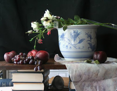
At this point, I was pretty satisfied with the values and moved on. Just a note here...the vase is a bit off and I corrected that before moving on and applying paint.

I struggled for awhile in deciding what color I wanted to use for the background and decided that a cool green would be nice. It would work well with the roses and the red fruit.

Next I painted the first coat for the vase. I used some of the background color and a mixture of naples yellow and white for the midtone and then a straight mixture of the naples and white for the lights. I used a pretty heavy application of paint and a healthy dose of Maroger medium here too. I wanted the paint to set up quickly so that I could continue to come back to it and add more paint and glaze if necessary.

Now for the fun part. I took some Maroger and mixed it up with some alazarin crimson to make a glaze and laid this into the plums. Whoa! I love glazing. All that light stuff you see? It's primarily glaze over a monochromatic under painting. Nice huh? The grapes too. I've made a mixture for the cloth here as well. I used white, umber and a touch of the crimson to make a warm shadow and pushed that into the base of the cloth. I lit the top side of the table. This is actually the reverse of what shows on my set up. This is because I have two windows and the one over my left shoulder sheds light onto the front of the set up. I have to compensate for this by painting the front darker at times then it would normally appear.
Using a similar mixture of the naples and white, I started laying in the flowers. I wanted to do this before the background completely dries and it would be difficult for me to create the atmosphere that I strive for on a dry background.
OK. I figured out at this point that glare was becoming a problem in the photos so I moved the easel away from the window to shoot this picture. Here you can see that I've started to put in quite a bit of detail. I added dark leaves to the background to make them fade into the background.

I've also taken a small mixture of cad orange, cad red light and naples yellow to make a orangy pink mixture for the top of the plums.
More dark foliage in the back of the fruit. I've painted some leaves in the fore ground and put in their shadows.
Additionally, I've enhanced the vase and put in some shadow under the rim. The table top is lit a bit more and I've darkened the background in the corners.
Some of the petals on the flowers were enhanced with a little yellow ochre and white.
I'm leaving the rest for tomorrow as I need the vase to dry before adding the glaze. Same for the fruit which needs a lot more work. Remember plums have a nice blue/white haze to them. I'll add more detail to the leaves, pushing some to the back and pulling some forward. I also intend to glaze into the background bring a bit more heightened interest to the center of the painting. So far I'm liking the progress. More tomorrow.


5 comments:
Thank you Susan. Wonderful work, and it's very important to me to see the way you work in grisaille, especially with acrylics, cause I want to use the same technique, and then, paint with oils after the grisaille.
Thank you so much!!
You're welcome Deia. Stay tuned. There's more to come! I hope to be making some videos soon and I'm working on an e-book!
Thanks for putting this post together! It is very good at explaining the grisaille process, I linked to it in my most recent post, as it is so descriptive!
so, you just use white and black acrylic for the grisaille? Doesn't the local color get muddy with the gray underneath? Nice painting.
Essentially, yes. It's just one of many ways of handling a grasaille. No, it doesn't make the colors muddy and as long as your values are correct, it goes a long way to helping your color work better because it tempers it and that extra layer of value makes the work richer. It is, afterall, the many layers of oil paint that help create it's beautiful luminosity. Thanks for your comment.
Post a Comment