Monday, May 26, 2008

How to paint an Asian Tea Pot and Peaches

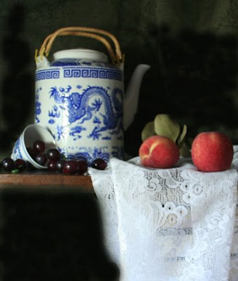
I recently spent a weekend in Victoria visiting with some friends. An afternoon jaunt to China Town netted me this lovely Tea Pot. I fell in love with the dragon. With summer nearly here and other demands calling for my attention, I thought I'd spend the entire day on this painting and see what the investment in time on a single sitting could yeild.

Here's the set up. I ended up changing a few things once I began the layin.

I love to paint lace and it's always a challenge to make it come out right. I nearly always have to remind myself to take my time on it. I'm always glad when I do.


I started the painting with a basic monochromatic underpainting using some acrylic black and white. I wanted to get a feel for the light in this piece and a good value study is always helpful. You can see that I kept things pretty loose and used a relatively large brush. I avoided details and just kind of played
with how I wanted the brush strokes to go. That's one of the cool things about working with acrylic at this stage. You get to see how things will play out. The lighting for the background was a bit tricky. I wanted it to be atmospheric and not too dark. But I didn't want it chalky either. I knew the transitions would be important.
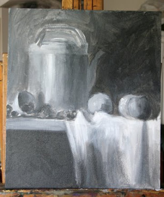


In the next picture you can see that I've laid in a background mixed from burnt umber, cad yellow and a touch of naples yellow for the lighter hue. I've blended that with a darker mix that has a bit of ultramarine blue and no naples yellow in it.
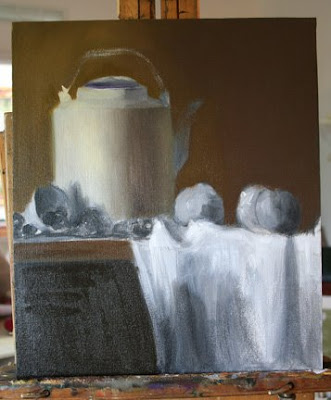


I smoothed out the brush strokes with a very soft black sable Performen brush. I love these brushes. They have a multitude of uses and cost relatively little compared to other sables. ASWexpress.com carries them.


Here you can see that I started with the base color of the tea pot. I've used titanium white, naples yellow, some background color and a touch of ultramarine blue. This is mixed in three shades from light to dark. I'm very careful to conserve the lightest light which will be used later for highlights on the pot.


A good thing to do when you are painting a light colored piece (or any color for that matter) is to squint down and compare the value of the object right next to the highlight. You'll be surprised at just how dark by comparison it really is.

Remember to keep your shadows thin and the lights thick. There's actually a good amount of paint on the lighter areas.


Now the peaches. First I mixed the shadow color using a bit of alazarin crimsen and sap green. I pushed this into the shadows of the fruit. Next I mixed a light mixture of cad yellow deep, cad light, background green and naples yellow - keeping the mixture light and not trying to over mix it. Stir it together on your palette like you are making muffins. Too much mixing and the muffins go flat.


Things are not too defined here and I'm keeping my edges soft. I'm looking for value changes and just trying to make sure that things stay where they are supposed to. There's actually three peaches on the right. One in front of the other and I'm struggling here to get one pushed back and the other brought forward.


A note about edges. Edges are like the marks on a music sheet telling the musician when to go slow and when to go fast. You edges are supposed to act as guides to the viewer, signaling them as to the pace of the painting. Your job is to conduct the symphony and lead the viewer where you want them to go. But it's best to leave all your edges soft until you get to near the end stages. Then you can adjust edges with a little more authority.
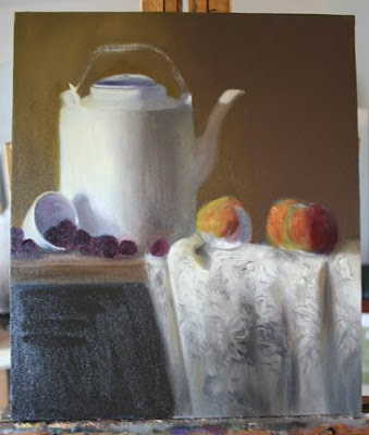

Notice the spout and how it appears to be covered with background color. That's because it is. When I lay in a color or area behind an object, I don't paint to the edge. This creates a edge that is too crisp making objects appear cut out or pasted on. The trick is to "paint through" the object. You can come back in later and paint back into the area appropriately. I've added it finally and put a light passage near the top in the next photo.


I've also laid in a basic color for the grapes. I started with alazarin crimsen and black but changed that to cadmium red and black. Worked better.


Here comes the lace. I thought a lot about what I was doing here so that I could explain it to you as I go along.


Basically, when you paint lace - and this goes for almost any medium, you paint the holes first. After laying in the cloth with a similar mixture to that of the tea pot, I took a bit of raw umber and background mixture and then took a soft brush and kind of stippled in the designs of the lace where the holes were. Don't worry too much about getting all the detail. If you get started with a basic pattern, just repeat it with a few variations making sure to follow the folds of the cloth. Pay attention to the lights and darks (overall values) on the cloth. You don't want to go light where you should go darker.
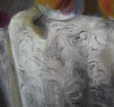

Oops! You can see I messed up got some paint where I didn't want it - namely on the peach. No worry - everything is fixable.


In order to brighten some of the pattern and make it stand out more, I mixed some of my light mixture with white and naples yellow and thickened it with Maroger. Then using a small brush I picked up bits of the paint and laid it on the areas where I wanted the pattern to stand out. NOT EVERYWHERE! Sorry. I sometimes get excited with my personal students too. Good thing they like me. Here's a close up before I put in the brights.


A note here about brush strokes. David Leffel (my hero), says that you should not be able to hear the stroke of the brush on the canvas. If you can you either don't have enough paint on the brush or you don't have enough medium on it. You should practice getting just the stroke you want with a loaded brush. A deliberate stroke that is not correct will look 100 times better than a correct passage that is overworked. This takes practice. Lots of it. So get your paints out and start painting a piece of fruit a day. By the end of the year, you'll either be fat as a cow from eating your leftovers or you'll be a genius at laying in paint. Or maybe both, but it will be worth it.


Ok. Here you can see the lights a bit better. Now that lace is starting to come to life. Now it's time to fix those poor peaches.
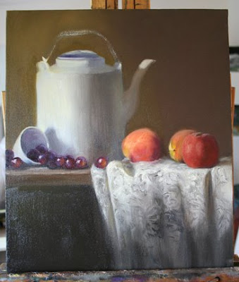

Placement is important here so I push the one in the back further against the background and reduce it's size a bit with background color and some adjustments to the cloth. This peach is furthest back and so it needs a soft edge where it meets the background color. I dragged some of the green down into it and soften the edge with my brush. The edge against the pot is a bit harder. I want a little air there between the peach and the pot. The colors are mixed with cad red light, cad yellow deep and cad yellow light. Not all mixed together, mind you, but in subtle ways to bring the color of the peach out. To turn the edge, I've used some of the back ground color and alazarin crimsen where the light turns to the shadow side.


The second peach also needs to be back a bit but not as far back as the formost peach. I've added a bit of green to the mixture. The peach fuz on the top is a mixture of cobalt blue and a bit of white. I've kept it's top edge soft and the left edge a bit sharper.


The peach in the foreground is lower on the surface of the lace. This brings it forward. It's edges are a bit sharper as well. But the shadow side is soft. Note the core shadow on the foremost peach. It turns the fruit.


I've added color to the grapes. A bit of blue (cobalt & white) for some reflection and a bit of cad yellow and rose for the areas of the grape where light shines through. The highlights are thick and I've run the end of my brush through them to add texture.
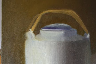

The handles have been ignored until now so it's time to give them a little attention. This is a simple mixture of yellow ochre. I've laid them in here with a bright brush to keep the square look I'm after.
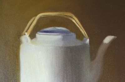


Next I lightened the mixture a bit and laid it into the areas where the light is hitting. Notice how everything is still fairly rough.


Lastly, I take a bit of umber softened with background green and make tiny little lines to indicate the weave pattern on the handles.


Here you can also see that I've started to lay in the design of the dragon. I mixed a glaze of ultramarine blue with a touch of alazarin crimsen to darken it and then started to work out the design of the dragon.


I'm really grateful for those life drawing groups I go to every Tuesday. All that sketching has paid off and allowed me to get the dragon in fairly accurately without a lot of fuss. If you are trying something like this, I would suggest that you first let the white paint dry. If it's dry, you can make all the mistakes you want because you can just wipe out the glaze and start over. Here my paint was still wet so not only could I not afford a mistake, I needed to lay the glaze on with short light strokes so as not to disturb the wet paint underneath.


After the dragon was finished, I put the design along the top edge of the pot in. I changed it from the design on the original pot to something simpler (my back was killing me).


From this point on, I adjusted edges, checked measurements and put in the leaves behind the fruit. Oh, yeah...notice the highlight in the final photo. See how light it looks against what you thought was a really light pot?


Phew. An all day painting session, but it paid off. What do you think?


Oh. Just a note here...I appreciate your comments on the blog but I'd like you all to feel free to start a dialogue where you can learn from one another too. Feel free to post and ask questions of each other.


"The Dragon Pot"
12" x 14", Oil on Canvas Panel

Monday, May 12, 2008

How to paint roses, Rose Oil Painting, 12" x 16" on Linen Panel


For a lot of people, the life of an artist seems like a romantic and dreamy existence. Well...it is, a lot of the time. But a lot of the time, it's just a huge amount of hard work and a pretty isolated existence. Every now and then, the routine of getting up early and going into the studio to paint or the office to work, or the gallery to handle business details, picking up supplies, dropping off at the post office, etc., etc., etc., gets to me. This weekend was like that so I took a few days off just to hang around, eat Weight Watcher snacks, read, play racquetball and ride my bike. Today, rested and refreshed, I went back to work.


The light in the studio was pretty bright but also pretty inspiring. I felt like white roses to go with the coolness of the setting. Here's the set up.


I always try to start my paintings with a concept. This is a thought that I have about what I'd like to achieve. It's not necessarily a picture in my mind, but more like an idea. The purpose of a concept is to provide a road map to the painting. If you hold your concept in mind throughout the process, it will keep you on track. It will also tell you when your painting is done. Once you have fulfilled your concept, then that's it. You're done. My concept for this piece was for overhead light which would pool over the top of the subject causing the objects below to be top lit. Instead of a transparent background, I wanted to have a very dark background to set off the roses.


I started the painting with a burnt sienna tone which I laid in the night before with a drop or two of Liquin to help it set up in time for the morning session. This morning, I did a quick outline of the subject in raw umber. Sorry for the poor photo - I held the camera here so things got a bit blurry. The rest of them are better.


I laid in the background - 2nd picture, with some umber mixed with thalo green and alizarin crimson. I left it loose around the flowers as I wanted some of the background sienna to show through around the roses.


I was using an ott light here on the painting as well as on the set up which, unfortunately, puts a bit of glare on the painting. I would turn this off from time to time to get a better reading on my values. The fact that I work in natural light most days, can create problems as I try to eliminate extraneous light sources and this can lead to a pretty dark room.

As I don't have overhead skylights in the studio, I needed a cool light source over my set up. So I set up one of my other Ott Lights over the set up. Because this does not exactly work the same as natural light on the subject, I had to turn this off from time to time to get a better idea of what some of the objects look light in dimmer light.


Next, using some burnt umber with a touch of cad orange, I laid in a quick color for the table top. This is just a base color as I intended to add reflections and highlights later.

The shadow color for the object - basically a burnt umber had been laid in at the initial start. It's important to get your shadow colors in first. They provide the bones of the painting and you don't want to be changing them later in the game. That is a recipe for disaster.


Using a mixture of naples yellow and white, with background color for shadow, I laid in the vase.

I use a medium called Maroger which helps to retain brush strokes. I sometimes let this sit on my palette in the freezer so that it's a bit more set up the next day. when I add this to the paint, it creates a stiffer mixture allowing me to sculpt the paint. The paint is thickest where the light is brightest and just before the turning edges of the vase. It's difficult to see in the photo here, but you can see it in the close-ups and in the final shots where I turned out the lights to take the picture.


In the picture to the left, I've started to put in the shadows for the roses. I used, again, part of the background color mixed with naples yellow/white mixture. A bit of violet was added in places.

The strokes laid in here are simple straight slashes made with a 1/2" and 1/4" bright. I'm trying to maintain the character of the roses. I try looking at them peripherally rather than straight on. This allows me to get the impression of the rose and its character rather than having to belabor the individual petals. My goal as a painter is to learn to say more with less. Quite a challenge for a former trompe l'oeil painter.


Here you can see that I've started to put in the lights. These were mixed with naples yellow and white - two mixtures. One light and one darkened with a bit of umber. Notice how light the mixtures look. On my palette they looked quite dark but when laid in next to the shadows the contrast in temperatures made them appear very bright. This is the same for the vase which appears quite lit but in reality is composed of darker value mixtures. I used some raw sienna in the lights for the warm centers of the roses.


You can see here the built up lights I was referring to above.


I'm finishing off the flowers here. Check out the pictures below to get a better idea of the details. They look a bit washed out by the overhead light here.


Using mixtures of thalo green, cad yellow and cad red to warm the mixture. I cooled areas of the leaves with naples yellow and white mixed in with the green mixture.

I then created a mixture of ultramarine blue tempered with some burnt umber and some Maroger to create a glaze. I worked this in the vase to recreate the design. Remember that a design can help to describe the form. I also lengthened the vase which I noticed was too short. This necessitated redrawing some of the fruit to drop it lower on the table.

The shadows of the fruit were laid in using some cad yellow, ivory black and cad orange. I used a cool yellow, zinc, to be precise, mixed with white for the sliced lemon. Warm tones were cad yellow medium and cad orange.


I took some of the cad colors and pulled the down into the table top to create reflections.


The lights for the lemons were done with cad yellow medium, and zinc yellow mixed with white. I left the lemon on the left in shadow.

Putting in the leaves on the right topped off the elements.

To finish off, I used a bit of quinacradone sienna on the table to create contrast. I further pulled down some of the lights in the vase and used a bit of ultramarine blue and white to create reflected light.

After a few tweaks here and there, I declared the painting done and put my name proudly on the bottom.

You can see the roses much better here because I turned out the lights for the picture. I'll try to remember to do this again in the future for the other pictures.

Phew. It sure takes a long time to write this stuff out. Hope you all got something from it.

I'd like to emphasize here how important it is to me that you leave a comment or two on the blog. For one, I'm happy to answer questions so that everyone can learn from them and, second, by posing questions or statements, you invite dialogue from others. This makes the blog more interesting and helps me to know what kinds of things you'd like me to focus on.

That's all. See you all in a couple of weeks.

To bid, click here.
If you haven't visited my Daily Painting blog, click here.


Monday, May 5, 2008

Seems blogger prempted my entry for today and published before it was finished. The entire lesson is now on line. Check it out.

How to paint Magnolias and Brass in Oils


My apologies for not having published here for the past two weeks. Sometimes the necessities of making a living can really keep me busy - or too tired to do anything. I actually started to prepare for a session a couple of times and found myself 1/2 way through a painting before I remembered to take a picture! Well...here I am and I have a good session for you.


Here's the set up. I recently swept into an antique shop and found this beautiful brass pitcher. I'm a sucker for brass and copper. They're both such fun to paint! The set up doesn't look very impressive here but the light in the studio was just perfect when I started to paint. Besides, the rest comes from artistic license and vision. My concept was for the light to pool a the round base of the pitcher and around the first flower. I wanted the rest of the fruit to gradually catch the light and then fade into shadow.


I've recently started working on linen for my larger pieces. I love the stuff. It's a medium grade oil primed linen that comes in a large roll. I ordered it from Art Supply Wharehouse.


I usually paint on boards which I prime myself with gesso or face with canvas. In order to prepare this board, I cut out the linen, primed the board to seal it and then using Golden's Medium Gell, I adhered it to the board and burnished it down with a brayer. A quick imprimatura of burnt umber and cad red and I was ready to paint. I laid in the drawing with raw umber, keeping everything simple. Then I mixed my background color - raw umber, cad yellow and a touch of cobalt blue. The lighter area is mixed with a bit more of naples yellow to lighten it. Next, I brushed in shadows on the table top.


Oops! I got carried away here and totally forgot to take a picture. This easily happens to me and I wised up after this and started setting my timer to remind me to stop and take a picture. The pitcher came together rather quickly. I mixed together some of the background color and some raw sienna. Another mixture a bit lighter with yellow ochre and a third mixture of yellow ochre and cad yellow. I have touches of cad yellow medium which is a sort of orangy yellow also. The highlights were built of cad yellow and white. At this point, the pitcher is in but not completed. I'll save the finishing tuches for later. Oh...black was used in sections around the edges to lose edges against the background and for depth. The black was tempered with umber.


A couple of more tweaks done here to the handle. Highlights with with more of the cad yellow mixture were laid in to the scrolling work.


I also lifted out some of the color where the flowers would be. That's one of the things I found strange about linen - how easily wet paint can lift from it.


I had to keep turning the easel around to take it out of the glare of the window, so I apologize for the strange angle of the canvas in these shots. Here I've laid in the shadow color of the lemons. I used some background color modified with cad yellow medium and cad orange to create the warm shadow color. The tough thing to remember about painting shadow color is that the thing to do is not necessarily try to match the color of the shadow, but the relationship of the color to the list side as well as the other colors around it. That's a trickey thing to do right. Once you understand this, however, you will understand that paint is not light or the object you are trying to represent. It has it's own qualities and laws. Understanding them is crucial to getting your objects to come to life.


Next I made a mixture from cobalt blue, cad orange and naples yellow for the shadow color of the blossoms. I also mixed in a bit of cad yellow for areas where light was shining through the petals. I laid this in carefully wherever there were petals that were showing in shadow.


A mixture of naples yellow and white made up my petals. I also made up a separate mixture a bit lighter for brighter highlights. I laid the petals in carefully - taking my time here to keep each petal separate. It's allright to let the bottom levels blurr into each other. This creates a soft admosphere. But on the upper petals, if you want the flower to be recognizeable, you need to keep each petal distinct from it's neighbor. Don't belabor the petals. Paint them with a large brush and pay attention to their character. Load your brush with generous paint. The underblooms should be painted thinly while the uper ones should have body.


Once the blossoms were in, I laid in the center of the flowers with touches of burnt umber and cad orange. The pollen laden stamen were just tiny bits of naples yellow.


Here's a closeup of one of the blooms with it's colors and all its nuances.


The lemons were next. Using cad yellow light and cad medium, I laid in the lemons. I watched out here for the warm reflected light in the shadows. It's lovely ahd can really help to set off the cool yellow.


I wasn't happy here with the strokes on the lemon. I soon found that if the paint wasn't laid in thickly, I'd be picking up paint already laid in. I intend to go over these tomorrow to correct stroke direction and refine the cast shadows a bit.


The last step was to put in the reflections on the table top and to lay in a few leaves and stems. Colors already on the palette were used here and nothing special in the way of mixtures was used. Tomorrow I may rework the lemons a bit but for now the piece is finished and on EBay.

Feel free to leave comments on this blog. I welcome questions and will try to answer them as best as I can.